Payscrub is a design solution for subscription payments management, made easy. Keeping track of subscription fees and payments for mobile apps, web purchases etc can be an overwhelming task. Payscrub is a carefully designed minimalist solution to help end users stay on track with their financial goals.
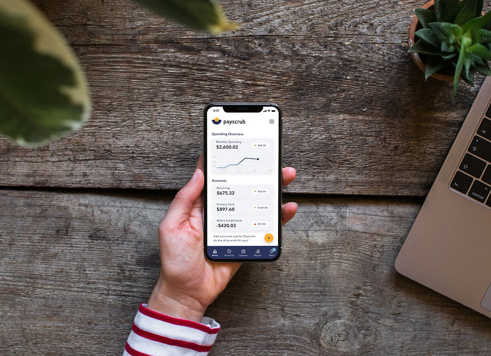
A thoughtful design solution for subscription payments management, made easy.
Payscrub Mobile App in action!
Overview
It’s difficult to keep track of all the products and services we subscribe to each month. We see the money deducted from our accounts for services that we might not even need or want any longer. Payscrub is a product that keeps track of all of your subscription fees on websites, apps, services, etc. charged to our accounts. Sync your accounts and credit cards to Payscrub and let it do the dirty work for you.
Objective
Payscrub is a desktop only website and not yet mobile friendly. A mobile friendly product will significantly increase their market reach and audience base. Target users:
30+ years of age.
Middle class and budget-conscious.
Individuals who use phone and desktop equally.
Constraints
This is a solo project that needs to be completed within a 90 hour timeframe. Solution musts:
A comprehensive view of spending on subscriptions.
Features to unsubscribe from a subscription to reduce needless spending.
Alerts and notification features to manage subscription renewals.
Brand attributes to represent trustworthy, caring, friendly and casual design.
My Role
This is a solo design project with the objective of creating a mobile friendly design solution and needs to be completed in 90 hours.
Key Skills
Heuristics Analysis, Ideation, Interviews, User Stories, Personas, Sketching, Information Architecture, Workflows, Wireframes, Visual Design.
Tools

Design Process

Discovery
Heuristics Analysis
To begin Payscrub’s transition to a mobile-friendly platform it was important to analyze the usability heuristics of industry leaders in this market. For this purpose I reviewed 3 popular companies that specialize in subscription transactions management. I analyzed Truebill, Track My Sub and Trim. Considering the business goals of PayScrub, I evaluated each mobile site based on these three heuristics:

Track My Sub
Track My Sub has a fun onboarding experience with questionnaire style information gathering and animations, but once at the landing page everything feels messy. It’s tricky to navigate and I was unsure how to sync with my financial institution. Track My Sub is more of a glorified spreadsheet than a payment subscription management mobile tool.

Truebill
Truebill gets down to business with a fairly simplistic and minimalistic design, it’s easy to navigate and has few frills. My impression is that Truebill serves its purpose and makes it easy for users to manage their subscription costs. Where it lacks is in user engagement and price. The app isn’t fun to use and depending on your subscription with Truebill you can spend up to $99 for the service.

Trim Trim is pretty straightforward and to the point. It helps users view and manage transaction subscriptions, and that’s all. Trim keeps things simple with a minimalistic design, blues, grey and green color palette and zero frills.

User Persona
This identified user persona illustrates the pain points and goals of the end-user for which the solution is being designed.

How Might We Problem Questions
I then created How Might We Problem Questions to explore ideas that would later help develop design solutions.
How might we help users keep track of their subscription fees for websites, apps and services?
How might we help users save money and time by making it easier to keep track of subscription fees for websites, apps and services?
How might we aid users in their quest for financial freedom?
Design
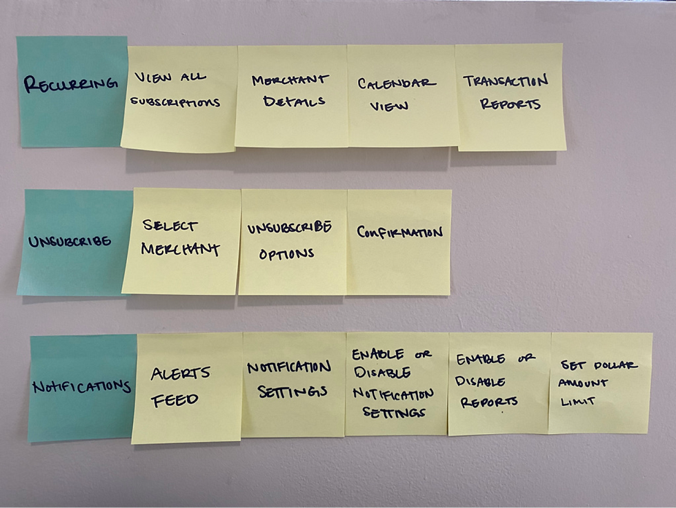
User Routes
I brainstormed user routes by putting myself in Kenny’s shoes and stopped at every point in his route to complete his subscription management needs.
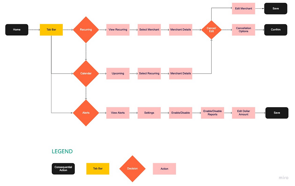
User Flowchart
I created a user flowchart to continue brainstorming possible red routes for our persona, Kenny. The user flowchart below represents the most comprehensive user flow for red routes and meet Payscrub’s business needs for its end users.
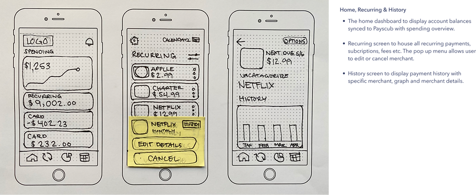
Sketches
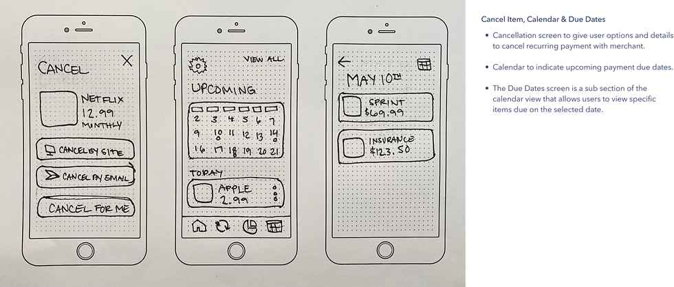
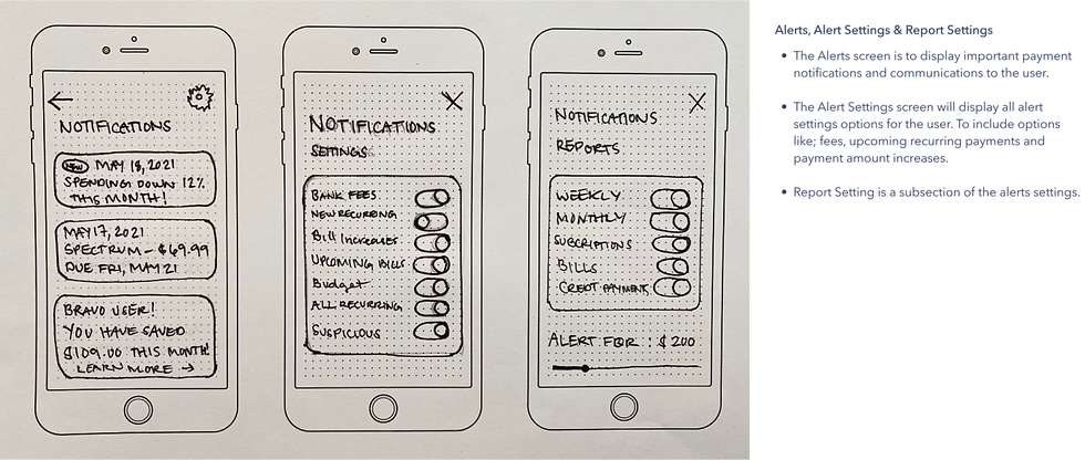
Using what I learned from my heuristics analysis, user persona and user flowchart, I created rough sketches of design solutions.
Wireframes
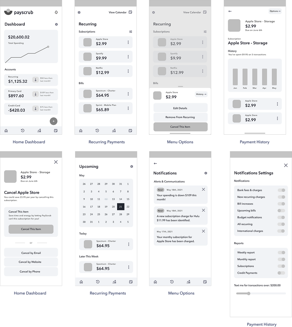
Wireframes allowed me to create low fidelity screen mockups that I could test with possible end users. Some key screens for this solution:
Validate
User Surveys
With a user survey I was able to identify usability testing participants that meet our target audience demographic. This also allowed me to learn some key details about the participants prior to usability testing.

Usability Testing — Wireframes
I first tested my low fidelity wireframes using an InVision prototype. I selected 3 users who meet the target audience demographic and each participant was given a series of tasks as they navigated the prototype.
Usability Testing Tasks
Identify icons and icon’s intended purpose.
Navigate to recurring charges and describe subscriptions.
Attempt to cancel first subscription, navigate to menu options. Return to recurring.
View merchant history for the first subscription. Return to dashboard.
Locate notifications and change notification settings.
Navigate to the calendar and identify upcoming subscription charges for the highlighted date.
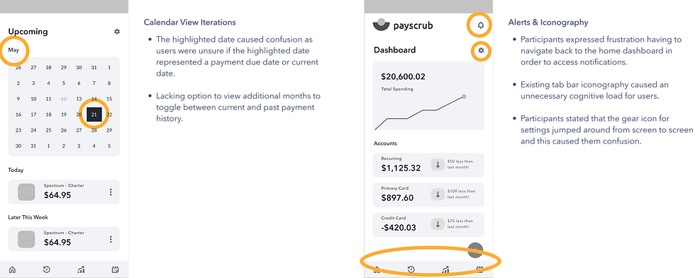
Usability Testing Key Findings:
Brand Platform & Style Guide
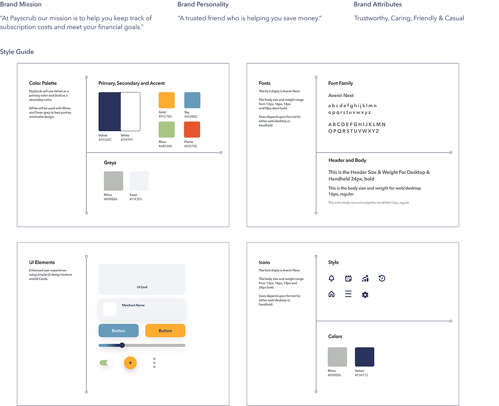
I created the brand platform and style guide for Payscrub as a key document to help communicate a consistent feel and look.
High Fidelity Mockups
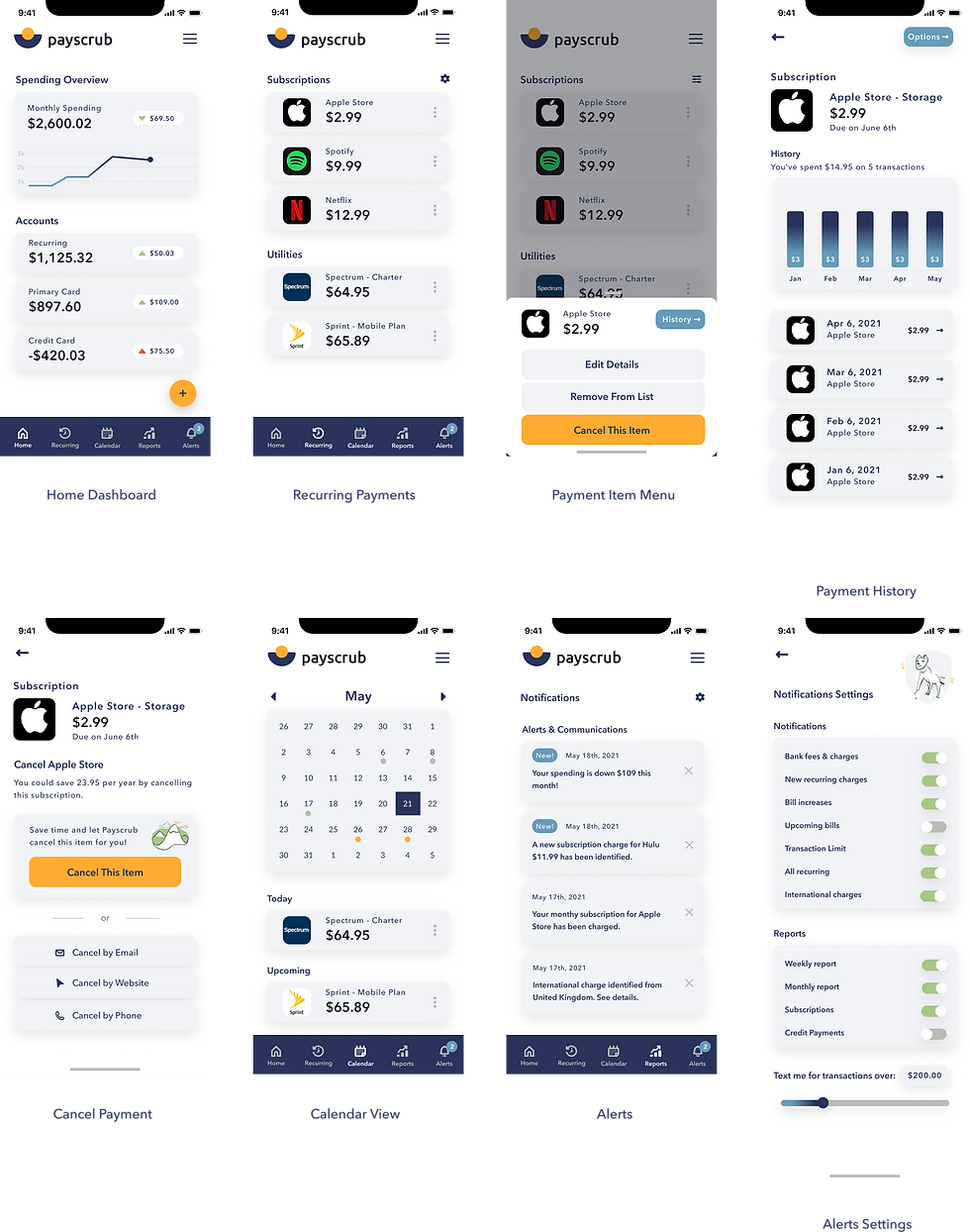
The low fidelity wireframe prototype testing key findings helped guide the design iterations for the high fidelity mockups. Please see key screens created for a second round of usability testing:
Usability Testing — High Fidelity Mockups
Using the high fidelity mockups, I created an InVision prototype for a second round of usability testing. I selected 5 participants who meet the target audience demographic and each participant was given a series of tasks as they navigated the prototype.
Usability Testing Tasks:
Identify icons and icon’s intended purpose.
Navigate to recurring charges and describe subscriptions.
Attempt to cancel first subscription, navigate to menu options. Return to recurring.
View merchant history for the first subscription. Return to dashboard.
Locate notifications and change notification settings.
Navigate to the calendar and identify upcoming subscription charges for the highlighted date.
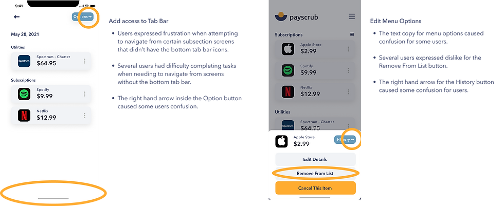
Usability Testing Key Findings:
Final High Fidelity Screens
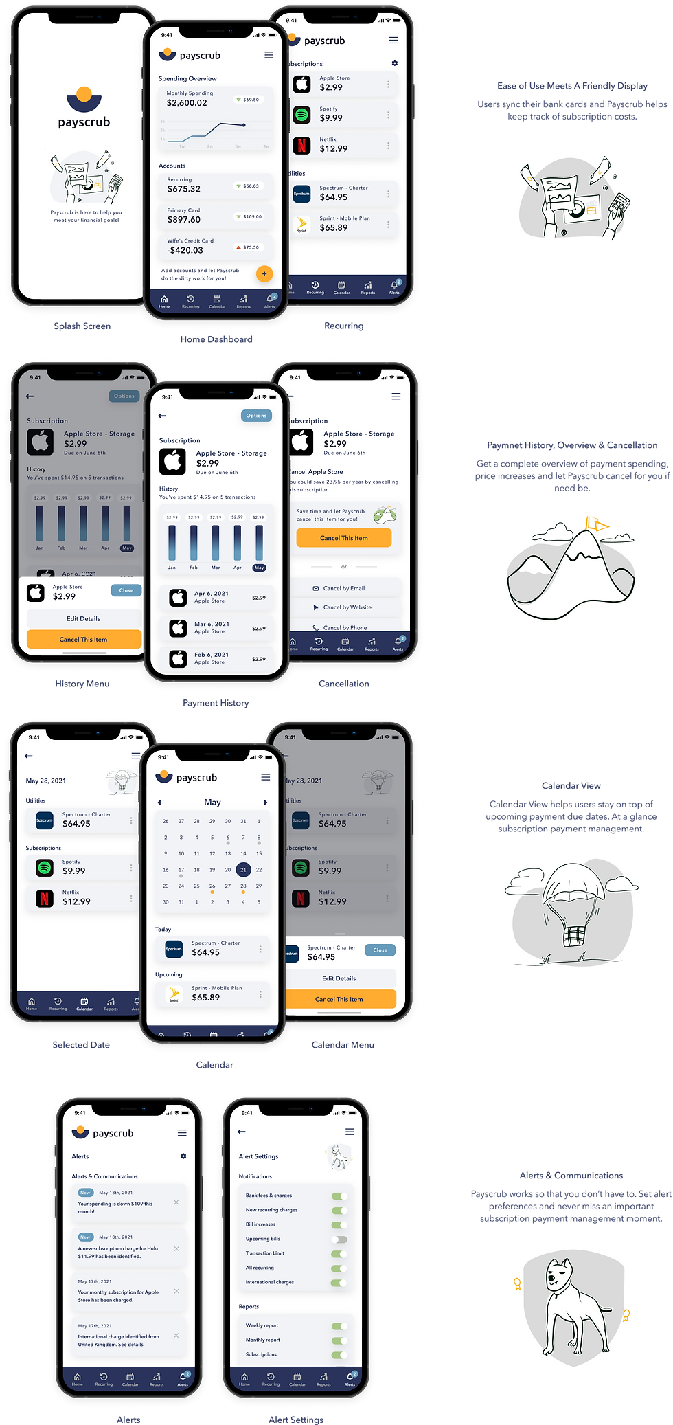
The second round of usability testing provided great key findings for final design iterations. See final high fidelity design iterations below:
Conclusion
This Payscrub design solution was guided by a user centered design focus, helping meet the needs of its end users. Through several rounds of testing and design methodologies, I was able to meet the needs of my end users while adhering to a tight set of deliverables and constraints.
If I were to continue designing for Payscrub, I would love to create beautiful solutions for the subscription payments reports, graphs and charts to further enhance the user experience.
As former financial industry career professional, I have a passion for assisting others in financial literacy and achieving their financial goals. Financial institutions don’t always make it easy, but I believe more financial management tools like Payscrub, could make a world of difference in people’s lives.
I look forward to more financial management design solutions as my UI UX career moves forward.
Thank you for reading my case study!

Comments